Saturday, September 12, 2009

another one from me.

Another one from my walk. In the Nunnery, there's a nice river that I found. The reflections on the water make for a great view, and the leaves in focus at the front provide an excellent depth of field. This image would've been very effective on a long exposure, because the waterfall would've been all flowing. There's always next time! :)
I also like how the waterfall is not central, as it plays to the rule of thirds very well. 2/3 of river, then the waterfall.

I have a few others. but i'm gonna save those. result! :D
peas.

Thursday, September 10, 2009

...this one is mine. :)


as well as creating a blog and updating it...often...we were also told to record some kind of Journey.

Now, I'm not one for walking.

but, I walked to town! (gasp!)

and on the way, I stumbled across this lovely little pathway. not intentional whatsoever. So me and my trusty Canon (i'm watching you, Nikon...) prodcued this bad boy. (up there.)

I like the colours its produced, and the way the path acts as a lure for the eye. Leading it to more important parts of the image. I think I may do photography for FMP. FML more like.

the colours being really bright also help lure the eyes in. which I like. :)

:D

F.A.B
(which, incase you didn't know, is off Thunderbirds and stands for "Fully Acknowledged Brief". Yeah. Didn't know that, did ya?)


Wednesday, September 9, 2009

Panoramas.

Okay, again...I found myself wandering aimlessly through Flickr's thousands of great images. this Panorama in particular took my fancy. ;)

I like Panoramas, for the simple fact that they make you feel like you are actually there, as you can see a full 180°. When I look around me now, its like a constant panorama...just in my bedroom. ;)

Another thing I like about this particular one, is the colours its used, while at the same time they're all green, how most of it has a grey/blackish tint to it. even the sky and clouds.

All this talk's making me want to go out and buy a tripod.
Back in a bit. ;)

Monday, September 7, 2009

9/11: 102 Minutes That Changed America

Just switched onto Channel 4 now, and this rather harrowing documentary is on. Compiled of never seen footage with audio clips and facts from New York citizens, its really quite terrifying.

Most of it is handheld, naturally. and there are some really great shots of the New York skyline, tainted with the masses of smoke coming from the World Trade Center. Some original interviews conducted by the news crews who were on the scene faster than your average American to a Burger King. Also, the use of foley sounds and sounds of people just talking about what has unfolded in front of them is quite effective, as it really puts you in their shoes and you're experiencing it with them too.

There's a nice "real-time" effect to this documentary too, every now and again you get a time update. nothing but numbers on the screen. the Hours, Minutes, Seconds and Miliseconds being updated constantly. but just for a few seconds. this furthers the viewers experience of it happening real-time and watching it unfold right in front of you.

if you're watching this after 11pm on Monday, watch it on 4oD here.

Sunday, September 6, 2009

work filled days and rain filled nights


Alright. So, as you probably know... Doctor Who is my forté. I was watching it the other day (the animated ones..) and then realised they're doing another one, but in a different animation style.

how bloomin' amazing?!

So yeah. it got me thinking about different styles of animation.

The top image is the original style of animation used for "The Infinite Quest" in 2007.
The bottom one is the newer style of animation used for "Dreamland" in 2009.

Personally, I like the newer version, as it brings the character to life more. this is probably because its in 3D, as opposed to the original which is literally 2D. Also, I think the colours in this newer style of animation is a lot brighter and fuller. As the newest of the two animation styles is yet to be seen on TV, I am basing this solely on the images above. also by the same token, i can't make any judgement as to how this will or won't affect the story in anyway. but I doubt it will.

ps. doctor who is awesome.

Thursday, September 3, 2009

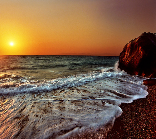
Alright, so whilst trawling through Flickr once again (Honestly, its all I seem to do now..) I came across this wonderful image. Its generally beautiful. the water splashes make for an interesting contrast with the colour of the sand, and the colours of the sky are just amazing! The way the colour bounces off the rocks makes the rocks look great, too. :)

I'll be back.

Peace.

http://www.flickr.com/photos/jup3nep/2778095123/sizes/m/

Tuesday, September 1, 2009

remember Jon Burgerman?


Do you remember? a few posts down? Jon Burgerman?
Well. I recently bought myself a bottle of Pepsi. and Look who's doing the Artwork on the labels?

None other than the man himself, Jon Burgerman! :)

Wheyyyyy!

Its a prime example of how different artists have a style and that they stick to one particular style rather than bounce around from category to category. They pick one that they like and it works. Especially this one. Its all so closely linked together, and the colours used are not 0nly important to creating the amazing effect, but also do well in keeping with the company colours.

Props to Burgerman. :)

Peace.

Saturday, August 22, 2009

"When this baby hits 88mph, you're gonna see some serious shit."


Literally, I just came home. and thought..blimey. I have college soon. yaaaaaaaay! man I love College. (Aaaaay)

um..
I literally just picked any picture at Random from Flickr, which, by the way has some good photo's, believe it or not.

Right then. the first thing I noticed and was drawn to was the fence, which in turn guides your eye from right to left, across the entirety of the image. Then there's the mountains, they contain some beautiful(!) colours in them. really, quite stunning. and how the colour of the mountain looks really great next to the bright blue sky. :)
Beautifully composed too, sticking to the rule of thirds perfectly.


Friday, August 14, 2009

Here I go again on my own.


Robert Capa
"The Death of a Loyalist Soldier"

Robert Capa is heralded as "The Greatest War Photographer of all Time." Not really a prestigious honour, really, but still his Images are brilliant. This particular one caused a lot of Controversy, because it shows the soldier being shot dead. However in another of Capa's photographs it shows the same man, after apparently being shot dead in this one. Its a lot like photograph of the 9/11 man (which can be found here) as it can either be perceived as real or fake. (However the 9/11 man has been proven to be fake.)

Rock and Roll, team.

PS. Its my birthday on Sunday. Woo!!! :D

Sunday, August 9, 2009

why not, eh? not doing anything else.


Jon Burgerman.

This is the main banner off his official site. I like the use of colour as it is eye catching and makes you want to look at it - and in doing so, you notice things inside, like faces and shapes.

The font used appears to be hand drawn, perhaps on a Drawing Tablet hooked up to a computer.

The title "My American Summer" is huge, which again makes you notice it and read on. Personally, its the first thing I noticed when I went onto the page because of the big bright colours it just grabbed my attention straight away.

s'later. :)

Tuesday, August 4, 2009

Good God. Is that was 9:30am looks like?

The Decisive Moment
by Henri Cartier-Bresson.

Personally, I really like this Photograph. its a great example of Cartier-Bresson's decisive moment, like I mentioned in previous blog entry.

"The Decisive Moment" is named this way due to the exact moment the picture was taken. If this was taken seconds later, the man would not be falling into the lake, there would just be a splash of where he'd fallen in.

Cartier-Bresson was born in France in 1908, and died 5 years ago yesterday (conveniently enough). The Decisive Moment would later be known as his trademark and would often be associated with this particular type of photography. He also popularised Street and Urban Photography, which has inpsired many more photographers to do the same.

Another photography in the same style involves a cyclist riding past at the exact time he takes the photograph, which works really well.


anyway. enough from me.
How're you?

Friday, July 31, 2009

hello again.


This is another photograph I took whilst in Glen Willan. However, without a tripod it meant i could not do long exposures as long as i'd like to, so i just had to stand really still... :D

coastal erosion is to blame for the waterfall, so i took the opportunity to create what i think is a pretty nice portrait shot. I went for portrait because, naturally, I wanted to get the entirety of the waterfall in. I originally just took it with a rather fast shutter speed (I think it was like, 1/500), but then noticed it'd work better with a slower speed (I settled on 1/10, the slowest i could make it without it blurring).


I also like how the flow of the water leads the eye right down the entirety of the image, past all of the colours and plants that are on the way.

i'll try and get another one in later on today. :)


Tuesday, July 28, 2009

Living with Michael Jackson

right, now i'm watching the infamous Martin Bashir documentary on the life and times of Michael Jackson. in hindsight, it was probably this documentary that sparked his trial in 2005. but anyway...

the very first scene is one which sets up what will be the Documentary, it show's Jackson's child-like demeanour, climbing trees and calling down to the camera man for attention. Using a variety of both Long shots and Close ups as Jackson Scales the tree which work effectively.

when Jackson finally comes down from the tree, we cut to an interview with Martin Bashir. The 180 degree rule is not once broken, and when Jackson becomes visually traumatised during this interview, it continues with the audio of him speaking but cuts to a segment of one of his early videos.

Later on in the Documentary it utilises time-lapses to show Bashir and Jackson's journey from Jackson's home to Las Vegas - all the time interspersed with fade cuts which show different aspects of the places they're travelling through. Personally, with Bashir's voice over the whole segment it works pretty well in showing the passing of time and the final destination after traveling.

Later on it uses Handheld camera work to follow Jackson around a Shopping Mall in which he buys most of the items in the stores. (furthering what Bashir claims to be "Eccentric Behaviour") When we get into Jackson's favourite shop, we get the handheld camera work to the extreme. Which works very well as it allows us to follow his every move and the view is not restricted as it would be on a tripod.

more tomorrow. :)

Summer Project.


Thank you, Adrian Cowin.
For now, my summer days will no longer be filled with Xbox, Partying-til-the-Early-Hours and Microwave food. :)

15 blogs? alright you're on.

conveniently enough, i was out yesterday in Glen Willan taking some pictures :)

The image attached to this post was taken at the beach just next to the campsite. Personally, I love how its very much "The Decisive Moment" by Henri Cartier-Bresson, because if i'd have taken this image seconds later, I wouldn't have got the wave splashing over the rock which I think works pretty effectively. :)

What I also like about it is how it abides to the Rule of Thirds pretty well, with it being approximately 1/3 beach, 1/3 sea and 1/3 sky.

Away with me. See you tomorrow, and the next day. and the next day. :)